
Like any parent unwilling to go on record identifying their favorite child, I plead the fifth on picking one logo that I love more than another. So why don’t we just agree to enjoy them all equally, shall we?
Branding for Cary’s latest business pursuit – Cary Zartman Originals. To see a wider array of its application, click here.
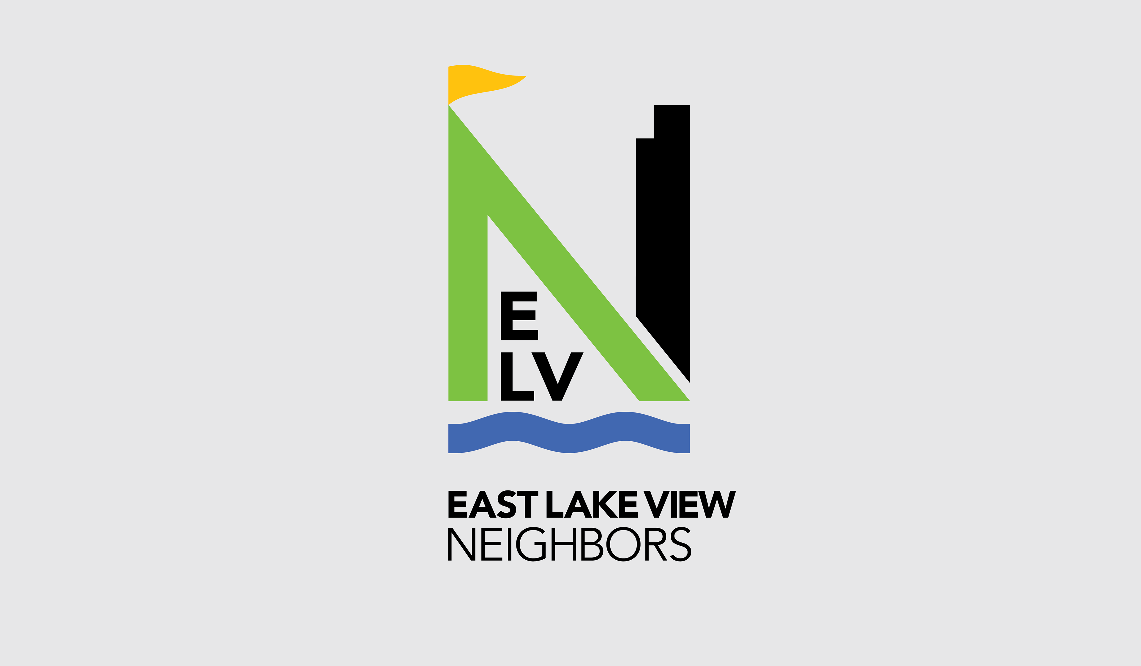
New logo design for the East Lake View Neighbors Association, reflecting their service area’s many high-rise buildings and immediate proximity to Lake Michigan and its related recreational pursuits. And while it is the neighborhood that anchors their efforts, it is the stately N in neighbors that truly drives their mission.
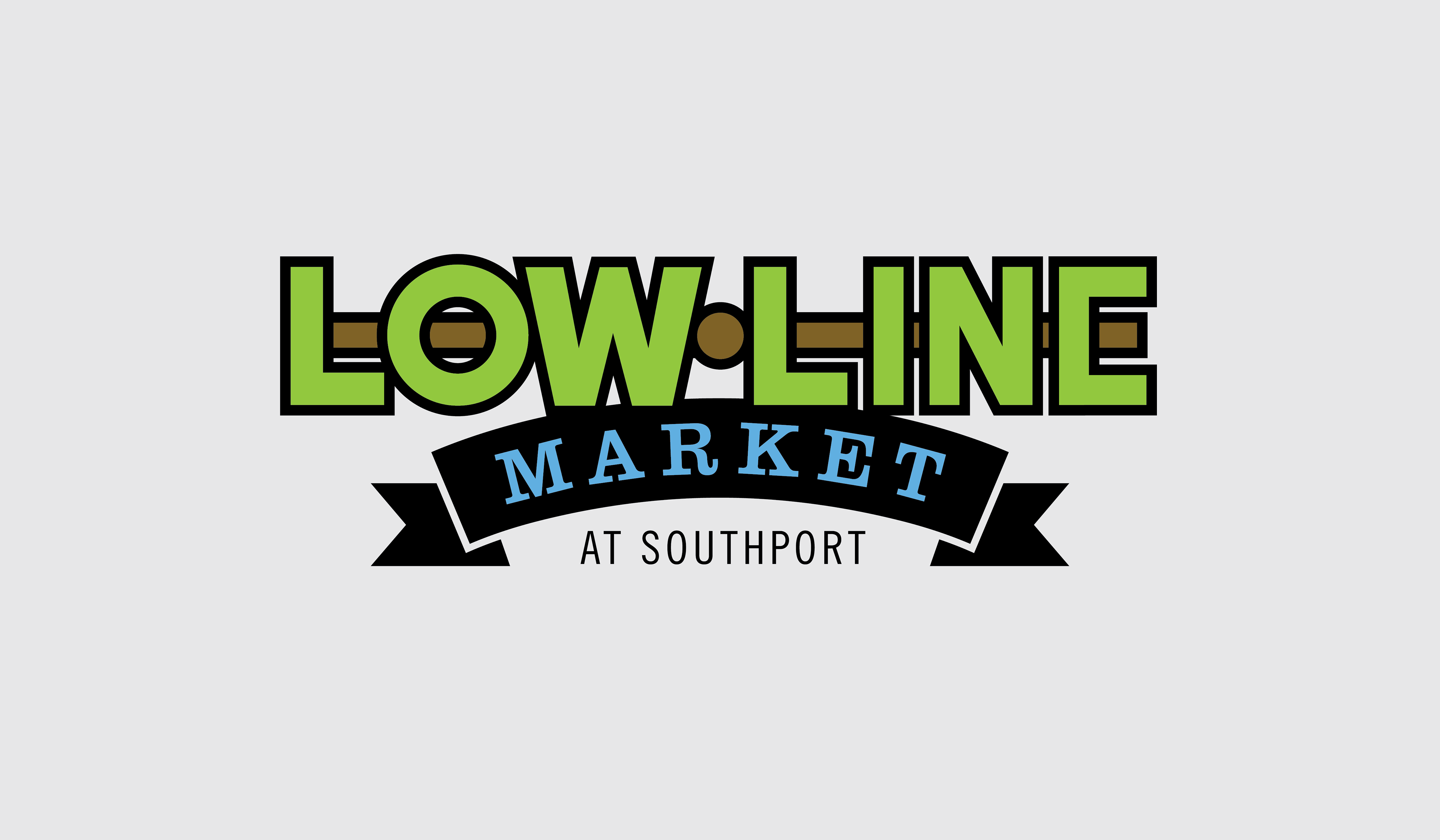
Branding for a new urban farmers market located conveniently at the exit of a CTA Brown Line station, and timed to capitalize on foot traffic from the evening commute. This identity draws inspiration from the mass transit mapping system, while hinting at the fun of market tents and banners.
Did you know that an aerie is the nest of a bird, such as an eagle, built on a cliff or other high place? Well, it’s also a handsome logo for a resort where you might see one.
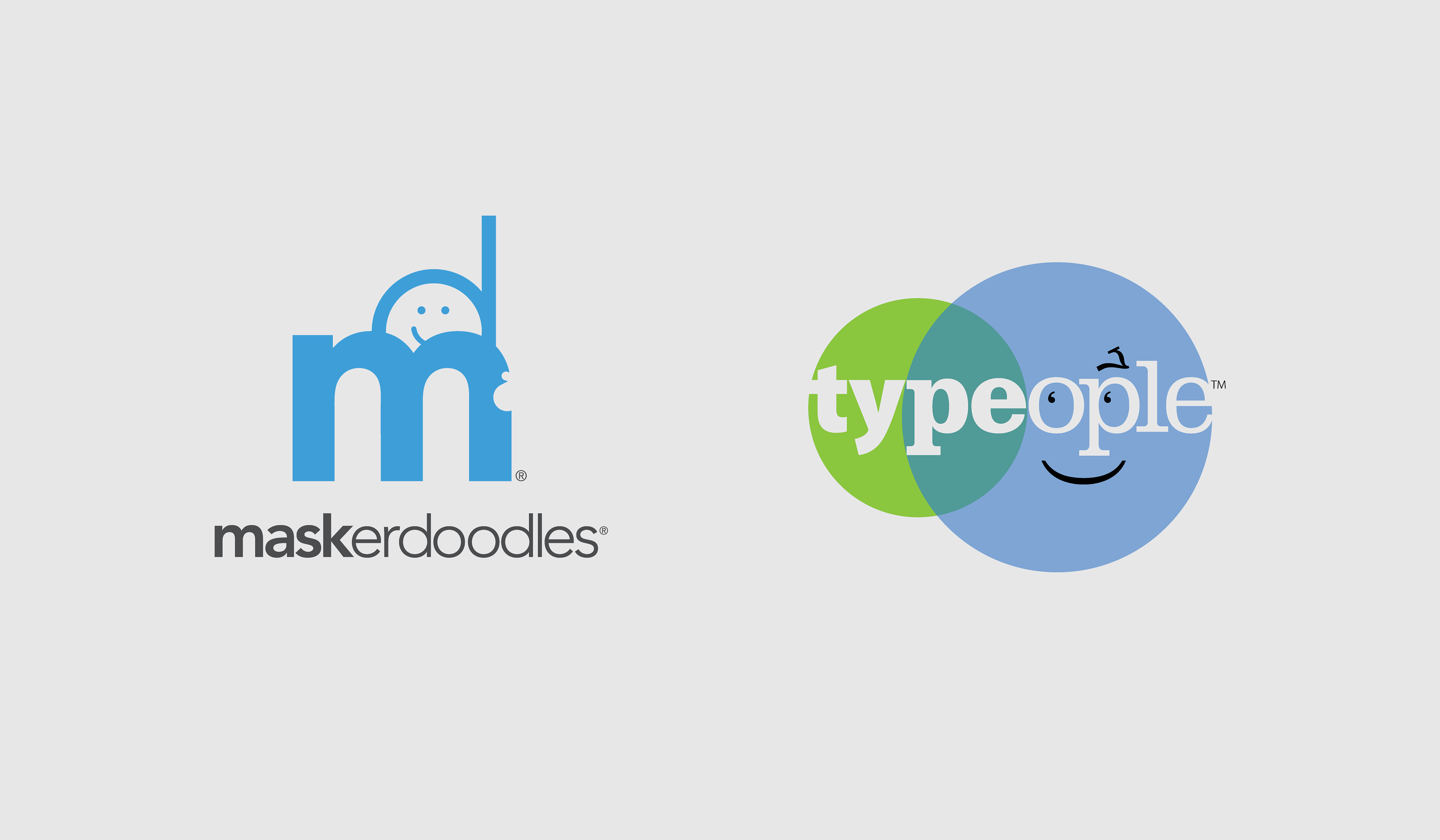
Branding for two of Z Factory’s many, MANY random business thoughts and creative outlets. To learn more about the Maskerdoodles and Typeople stories, click here.
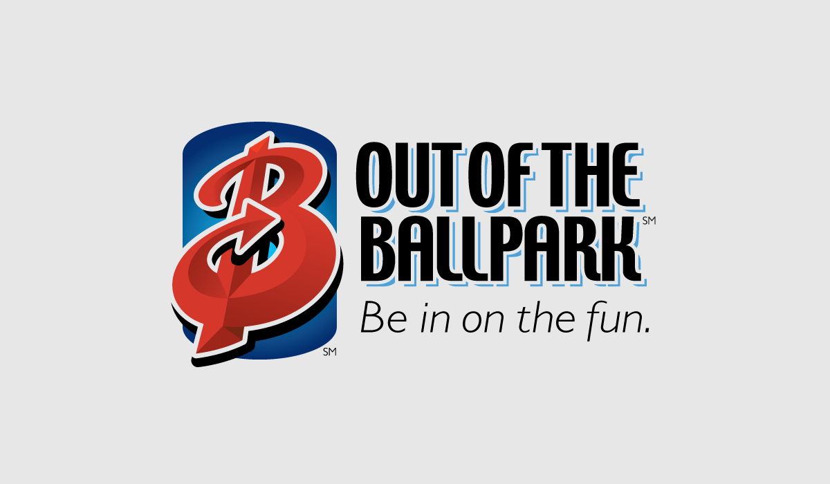
Find a need, then build a business. That’s what we did when it came to creating this tourism-based print and online guide. When you live within pitching distance of an iconic sports landmark that attracts hundreds of thousands of people year-round, you get stopped more than a few times and asked if there’s a good place to eat. Or drink. Or insert-other-way-to-pass-the-time-enjoyably here. So what better answer is there than to pull back the neighborhood curtain and introduce everybody to some of the local favorites?
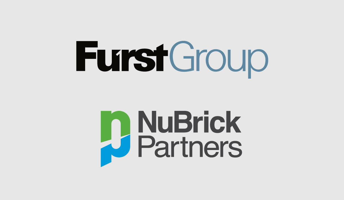
Rebranding and initial branding for sister companies in the professional recruitment and related consulting industries. To get a deeper dive into the expansive work I did for both of these companies, click here.
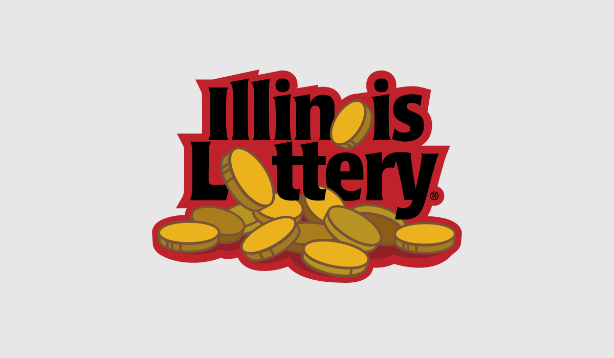
This rebranding Top 10 finalist, dubbed "Coin Dance," was part of a statewide competition to commemorate the Illinois Lottery’s 25th anniversary.
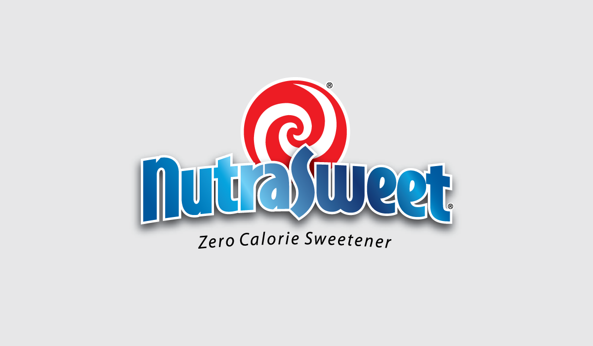
Rebranding for one of the world’s best-known sweeteners. The swirl provided the backdrop – both visually and strategically – for a brand update that captured a more playful expression for treating yourself... without adding calories. To see a more in-depth exploration of the NutraSweet branding and packaging update, click here.
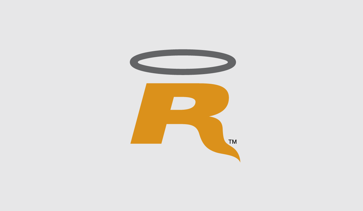
Branding for the launch of OptionRATS, a company that provides options professionals with timely trading information. Which makes them angels-in-waiting when it involves the proper management of your money.
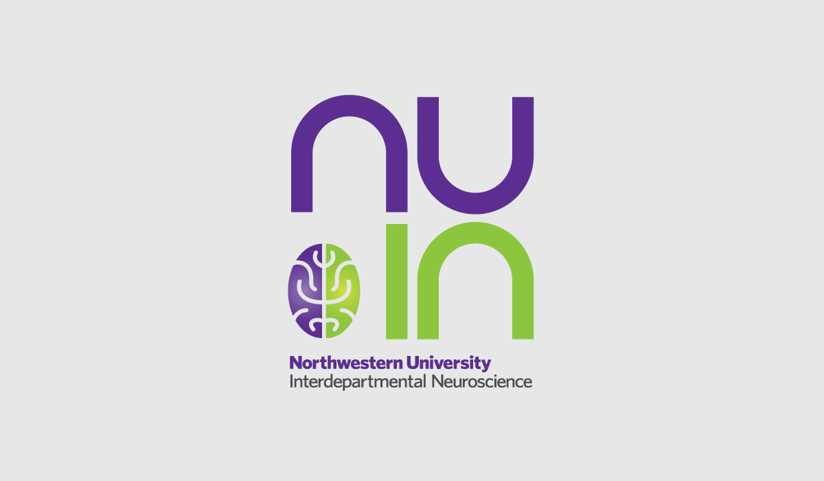
A new logo for the Interdepartmental Neuroscience Department at Northwestern University designed in a way that would be more visually exciting and involve way less words and letters.
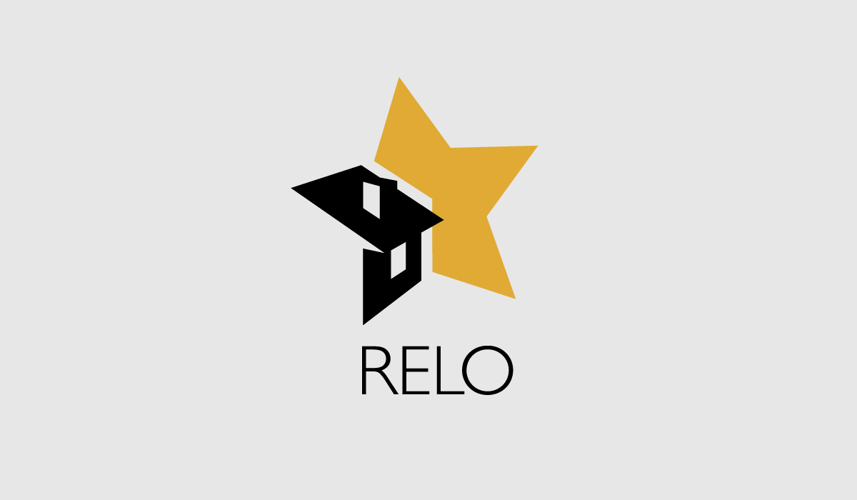
Proposed rebranding for a national network of independent real estate companies whose intent is to establish the gold star standard for relocation and placement services.
Branding for an environmentally responsible and internationally endorsed certification program supporting well-maintained forests. To see a more in-depth exploration of the SFI branding, click here.
See related projects under PRINT WORK.